Hey there, fellow marketers and website owners! Ready to take your conversion rates to the next level? We’ve got just the thing for you in today’s blog post – a roundup of 5 killer call-to-action button examples that are guaranteed to boost your conversions. From snappy and attention-grabbing phrases to enticing color choices and irresistible designs, we’re covering it all. Whether you’re a seasoned pro or just starting, these real-world examples will inspire you to create compelling CTA buttons that your visitors won’t be able to resist clicking. So, grab a pen and paper, and get ready to transform your website into a conversion powerhouse!
What Is a Call-to-Action Button?
In the realm of web design, a call-to-action (CTA) button holds immense importance as a clickable element that effectively prompts users to engage in specific actions. These buttons serve as powerful tools to direct visitors toward the next steps in their online journey. Whether it be encouraging users to sign up for an email list, enticing them to download a valuable freebie, or driving them to interact with various captivating content, CTAs play a pivotal role in guiding user behavior on a website. They create a sense of urgency and instill a desire to take action, ultimately enhancing user experience and optimizing conversions. With their strategic placement, attention-grabbing design, and compelling messaging, CTAs are the linchpin of effective web design, boosting user engagement and propelling businesses toward their goals.
Meanwhile, when it comes to web design, it is crucial to prioritize the placement of call-to-action buttons that are easily noticeable and utilize straightforward language such as “Sign Up” or “Download Now” to encourage user engagement. Moreover, strategically incorporating colors and design elements to make these buttons stand out not only enhances their visibility but also entices users into taking the desired action, like making a purchase or engaging in a call. By implementing these elements into website designs, businesses can effectively guide users toward their conversion goals while creating a visually appealing and engaging online experience in a tone that resonates with their target audience.
The Benefits of Including a CTA Button in Your Web Design
When it comes to web design, strategically placed CTA buttons play a crucial role in capturing the attention of users and directing their actions. These buttons serve as powerful visual cues, effectively highlighting the most important elements on a website. By offering clear directions, they guide users to take specific actions like making a purchase or subscribing to a newsletter. A well-designed CTA button not only enhances the overall aesthetic appeal of a webpage but also creates a seamless user experience by guiding visitors towards key conversion points. With the careful placement and thoughtful design of these buttons, web designers can optimize user engagement and drive desired actions, ultimately contributing to the success of a website.
However, the effectiveness of the CTA button goes beyond just increasing conversions. In the vast world of web design, where user experience plays a crucial role, the CTA button serves as a beacon guiding users towards their desired actions. By providing a direct link that users can simply click on or tap, the CTA button eliminates any unnecessary steps or confusion that may hinder their journey on the website. Whether it’s calling a business or making a purchase, the CTA button streamlines the process, ensuring a smooth and seamless user experience. Its simplicity and convenience create a sense of trust and reliability, making users more likely to engage and convert. Ultimately, through its strategic placement and clear call-to-action, the CTA button enhances not only conversions but also the overall success of a website by optimizing user experience and facilitating desired actions.
Crafting an Attention-Grabbing CTA Button
When it comes to web design, crafting an attention-grabbing CTA (Call-to-Action) button is crucial in order to effectively draw visitors to your website and encourage them to take action. A well-designed and strategically placed CTA button can make all the difference in capturing your audience’s attention and converting them into valuable leads or customers. By using visually appealing elements, such as vibrant colors and compelling copy, you can create a sense of urgency and compel visitors to click on the button. Additionally, optimizing the placement and size of the CTA button plays a significant role in its overall effectiveness. With these key elements in mind, your CTA button can become a powerful tool to increase user engagement and drive conversions on your website.
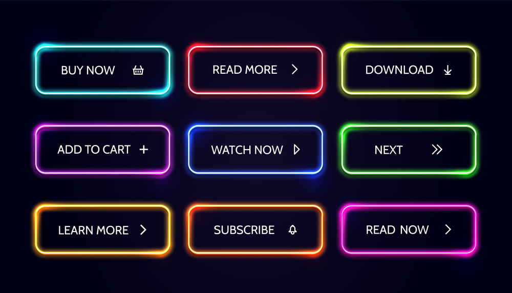
When it comes to web design, one crucial aspect to consider is the effectiveness of your CTA button. To capture the attention of your visitors and encourage action, it is essential to ensure that the colors, size, and text of your CTA button are eye-catching and that it stands out from the rest of your page design. By using vibrant colors and contrasting them with the background, you can create a button that instantly grabs attention. Additionally, the size of the button should be large enough to make it easily clickable and noticeable. To further enhance its impact, the text on the button should be concise yet compelling, using persuasive phrases that prompt immediate action, like calling or making a purchase. By paying careful attention to these design elements, you can create a visually appealing and persuasive CTA button that effectively drives conversions on your website.
Finally, when it comes to web design, understanding how to use call-to-action buttons to encourage visitors to take action is paramount. In addition to crafting compelling content and using persuasive language, it is crucial to strategically place the CTA button in a prominent location on the page. By positioning it at the top or bottom corner, where it remains easily visible even as visitors scroll or navigate away from the homepage, you can ensure that people do not miss the opportunity to engage further. Remember, an effective CTA button that stands out and beckons users to click can make all the difference in converting casual visitors into loyal customers. So, take the time to thoughtfully design and position your call-to-action buttons to maximize their impact on driving interactions and achieving your website’s goals.
5 Examples of Effective Call-to-Action Buttons
When it comes to web design, the effectiveness of call-to-action buttons should be given careful consideration. These buttons play a crucial role in guiding users and encouraging them to take specific actions on the website. To understand the significance of well-designed call-to-action buttons, here are 5 examples that exemplify their effectiveness. These examples serve as valuable insights for web designers to create buttons that are visually appealing and compelling, ultimately enhancing user engagement and conversion rates. By incorporating these principles into the design process, websites can effectively guide users toward desired actions, leading to a more successful online presence.
When it comes to web design, one crucial element is the strategic placement of buttons that prompt user engagement. One prime example of this is the “Sign Up Now” button. By incorporating this button into your website or product, you can effectively compel users to take action and express their interest in what you have to offer. This type of button functions like a calling to potential users, encouraging them to create an account and become part of your online community. Furthermore, it serves as a powerful tool for driving sales by acting as a virtual gateway for users to make a purchase. By strategically employing such buttons throughout your web design, you can enhance user experience and boost conversions.
When it comes to web design, incorporating call-to-action buttons is crucial to encourage visitors to take action. One effective example is a “Learn More” button, strategically placed on the main page of your website. By enticing users to explore further, this button serves as a gateway to delve deeper into the features and benefits of your product or service. Its prominent location ensures easy accessibility, making it more likely for users to click on and engage with your content. By using call-to-action buttons effectively, you can effectively guide your visitors towards taking the desired action and ultimately drive conversions.
In the realm of web design, incorporating an enticing and practical feature is crucial for enhancing user experience. With this in mind, a well-placed “Download Now” button is particularly effective in facilitating swift and hassle-free access to content. This can be advantageous when users desire to quickly acquire an app or delve into a white paper that offers comprehensive insights about your business or product. By seamlessly providing the means to obtain valuable information, this clickable button greatly contributes to a smooth and efficient user journey. Furthermore, it is worth noting that a readily available download option not only caters to the needs of those seeking immediate assistance or clarification but also encourages prompt actions, like calling or making a purchase. The tone here aims to highlight the importance of the download button while emphasizing its role in enhancing user convenience and facilitating desired outcomes.
When it comes to web design, incorporating effective strategies for gathering data and insights from customers is crucial. One such strategy is the use of a “Submit” button in forms or feedback sections. This simple yet powerful feature allows visitors to provide valuable information, allowing businesses to gain a deeper understanding of their customers’ needs and preferences. By encouraging users to click the “Submit” button, you can capture important data that can be used to optimize website performance, refine marketing strategies, and make informed business decisions. This user-friendly feature not only enhances the overall web design but also fosters a positive and interactive experience for visitors. With the help of the “Submit” button, your website can become a valuable tool for collecting insights and driving continual improvement.
Also, when it comes to web design, incorporating a “Shop Now” button is crucial for eCommerce websites aiming to encourage immediate purchases. This simple yet powerful feature acts as a call to action, prompting visitors to take the next step in their buying journey. By prominently displaying a “Shop Now” button, web designers can effectively guide users towards making a purchase and eliminate any unnecessary steps or distractions that may hinder the conversion process. With just a click of a button, customers are directed straight to the checkout page, streamlining their experience and minimizing any potential frustrations. Hence, including a “Shop Now” button in the web design of eCommerce platforms is an effective strategy to drive sales and enhance the overall user experience.
Best Practices for Optimizing Your CTA Button’s Performance
In the realm of web design, understanding how to effectively utilize call-to-action (CTA) buttons is crucial in encouraging visitors to take action. One key aspect is placing the CTA button in a visually prominent spot on the page, whether it be at the top or bottom. This strategic placement ensures maximum visibility for the button, allowing it to stand out from other elements on the page. By implementing this technique, web designers can guide users toward important actions, such as making a purchase, subscribing to a newsletter, or signing up for a service. The overall tone underscores the significance of optimizing CTA buttons to drive user engagement and ultimately meet the desired goals of a website.
Additionally, to optimize your CTA button performance and effectively encourage visitors to take action, it is crucial to pay attention to the design aspects of your website. By ensuring that your CTA button is clearly labeled with concise text and strong action words, you can motivate visitors to engage with your desired conversion goal. The purpose of a CTA button should be easily understood at a glance, without requiring visitors to spend excessive time or effort deciphering its intention. A well-designed website takes into account the importance of intuitive navigation, visually appealing buttons, and compelling content placement. By following these guidelines, you can create an engaging user experience that maximizes the impact of your Call-to-action buttons and ultimately drives conversions on your website.
Analyzing the Impact of Your CTA Button
When it comes to web design, the impact of a call-to-action (CTA) button cannot be overlooked. Understanding how to use these buttons effectively is crucial in encouraging visitors to take action. When analyzing the impact of your CTA button, it is important to consider its relationship with the overall web design. Is it easily visible on the page? Does the font size and color make it stand out from the other content? These considerations play a significant role in capturing the attention of users and enticing them to engage with your website. A well-designed CTA button should be strategically placed and designed in a way that draws the eye and compels visitors to take action. By keeping these factors in mind, you can enhance the effectiveness of your CTA buttons and ultimately increase user engagement on your website.
All in all, when it comes to web design, it is crucial to give careful consideration to the placement of the call-to-action (CTA) button on the page. The placement of the CTA button should be intuitive, making it easy for users to locate and engage with. Ensuring that the CTA button is strategically positioned within the context of the web page enhances its effectiveness and increases the likelihood of user interaction. By optimizing the placement of the CTA button, web designers can create a user-friendly and engaging online experience that encourages visitors to take action. So, remember to pay attention to the placement of your CTA button and ensure that it aligns with the overall design and purpose of your web page.
Wrapping up
In conclusion, incorporating effective call-to-action buttons is an essential strategy for increasing conversion rates on your website. By implementing the 5 killer examples we’ve shared in this blog post, you’ll be armed with the knowledge and inspiration to create compelling CTA buttons that demand your visitors’ attention. From crafting snappy phrases to selecting enticing color schemes and irresistible designs, every element matters when it comes to driving conversions. So, don’t wait any longer – start experimenting with these strategies, and watch as your website transforms into a conversion powerhouse. Grab that pen and paper, and let the transformation begin!