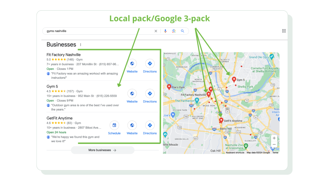
A Comprehensive Guide to Structuring Your Site’s Content with Clear Menus 

In the digital realm, the clarity and organization of your website can make or break your online presence. An effective menu structure is the backbone of a user-friendly site, guiding visitors seamlessly to the information they seek and enhancing their overall experience. With the rise of digital marketing and the increasing competition for user attention, it has become essential for websites to provide a smooth and intuitive navigation experience. A well-designed menu not only helps users find what they’re looking for quickly but also keeps them engaged, reducing bounce rates and increasing the likelihood of conversions. 

Moreover, search engines like Google place a high value on user experience, and a clear, logical menu structure can significantly boost your site’s SEO performance. When your content is organized in a way that makes sense to both users and search engines, your site is more likely to rank higher in search results, driving more organic traffic. This comprehensive guide will explore the strategies and best practices for structuring your site’s content with clear, intuitive menus. From categorizing your pages logically to designing an aesthetically pleasing layout, we’ll cover all aspects of menu design to help you create a navigational structure that is both efficient and engaging. 

Whether you’re starting from scratch or looking to optimize an existing site, these insights will ensure your visitors enjoy a smooth and satisfying journey through your content. By the end of this guide, you’ll have the tools and knowledge needed to build a menu structure that enhances user experience, improves SEO, and supports your website’s goals. So, let’s dive in and discover how to make your site’s navigation a powerful asset for your online success. 

Understanding Your Audience 

Before diving into the design of your website’s menu structure, it is crucial to understand your audience. Identifying and understanding your target audience is the foundation of creating a site that resonates with users and meets their needs. Begin by analyzing the demographics, preferences, and behavior of your potential visitors. Who are they? What are their interests and pain points? What kind of information are they seeking? This information is vital as it influences how you organize your content and structure your menus. 

Creating user personas can be an effective way to encapsulate this understanding. User personas are fictional representations of your ideal visitors based on real data and insights. These personas help you visualize your audience and keep their needs and preferences at the forefront of your design process. For example, if your primary audience consists of busy professionals seeking quick access to information, your menu structure should prioritize ease of navigation and clarity, ensuring that users can find what they need without unnecessary clicks. 

Analyzing user behavior through tools like Google Analytics can provide additional insights into how visitors interact with your site. Look at metrics such as bounce rate, average session duration, and user flow to understand which areas of your site are performing well and which may need improvement. By understanding where users spend the most time and where they drop off, you can make informed decisions about how to organize your content and design your menu structure. 

Ultimately, understanding your audience is about empathy and usability. By putting yourself in the shoes of your visitors and considering their journey through your site, you can create a menu structure that is intuitive and user-friendly. This thoughtful approach not only enhances user satisfaction but also drives engagement and achieves your website’s goals. As you move forward with designing your menu, keep these audience insights in mind to ensure that your navigation is tailored to meet the needs and expectations of your users. 

Planning Your Menu Structure 

Planning your menu structure is a critical step that lays the foundation for an effective and user-friendly website. It begins with a comprehensive mapping out of your site’s content. Start by listing all the pages and sections you want to include, from the most important ones like the homepage, about page, and contact page, to more detailed content such as blog posts, product categories, and service descriptions. This content inventory allows you to see the full scope of your website and identify how different pieces of content relate to each other. 

Once you have a clear view of your content, the next step is organizing it into logical categories. Group related pages together under common themes or topics. For instance, if you run an e-commerce site, you might categorize your products by type, such as clothing, accessories, and footwear. Within these main categories, you can create subcategories to further refine the navigation. This hierarchical structure not only helps users find what they’re looking for but also makes your site more understandable to search engines, which can improve your SEO. 

Prioritizing key pages and sections is also essential. Determine which pages are most critical to your users’ journey and ensure these are easily accessible from the main menu. For example, if your goal is to drive sales, your product or service pages should be prominently featured. If you want to build trust and credibility, ensure that your about page and testimonials are easy to find. Additionally, consider the placement of these key sections within your menu. Items placed at the beginning or end of a menu are often more noticeable and likely to be clicked on. 

During this planning phase, it’s also helpful to create a sitemap, a visual representation of your site’s structure. This can serve as a blueprint, helping you visualize how users will navigate through your site and ensuring that the flow of information is logical and intuitive. A well-thought-out sitemap can also be a valuable tool for communicating your vision to developers and designers who will bring your site to life. 

By meticulously planning your menu structure, you ensure that your website is organized, intuitive, and aligned with your users’ needs and your business goals. This planning not only sets the stage for a seamless user experience but also lays the groundwork for a successful and engaging website. 

Designing the Menu 

Designing your website’s menu is a crucial step that significantly impacts user experience and navigation efficiency. A well-designed menu ensures that visitors can easily find what they are looking for, thereby enhancing overall satisfaction and engagement. When approaching menu design, it’s essential to follow best practices that prioritize usability and aesthetics. 

Start with the layout and structure of your menu. Decide whether a horizontal or vertical layout best suits your content and audience. Horizontal menus are commonly used for their familiarity and ease of access, especially on desktop devices. They typically sit at the top of the page and can include dropdowns for subcategories. Vertical menus, often found on the side of the page, can be particularly effective for sites with extensive content, as they allow for more categories and subcategories to be displayed without overwhelming the user. 

Next, focus on creating intuitive navigation labels. The text used in your menu should be clear, concise, and descriptive. Avoid jargon or overly technical terms that might confuse visitors. Instead, use straightforward language that accurately describes the content or function of each menu item. For example, instead of using “Resources” for a section that contains articles and guides, use “Articles & Guides” to give users a clear idea of what they will find. Effective labels help users quickly understand their options and make informed choices about where to navigate next. 

Incorporating visual design elements is another key aspect. Use consistent typography, colors, and icons to create a cohesive look and feel that aligns with your overall website design. Highlighting active or hovered menu items with subtle color changes or underlines can improve usability by providing visual feedback to users about their current location or selection. Ensure that your menu is visually appealing but not overly flashy, as simplicity often enhances clarity and ease of use. 

Considering mobile-friendly design is essential in today’s multi-device world. With a significant portion of web traffic coming from mobile devices, your menu must be responsive and easy to navigate on smaller screens. Implementing a collapsible or “hamburger” menu for mobile devices can save space and create a cleaner layout. Ensure that touch targets are appropriately sized and spaced to prevent accidental clicks, and test the menu on various devices to confirm it functions smoothly across different screen sizes. 

Finally, remember to test your menu design extensively. Conduct usability tests to gather feedback from real users about their navigation experience. Pay attention to any pain points or areas of confusion they encounter. Adjust your design based on this feedback to refine and improve the user experience continuously. 

By following these best practices in menu design, you create a navigation system that is not only visually appealing but also functional and intuitive. A well-designed menu enhances user satisfaction, encourages deeper exploration of your site, and ultimately supports your website’s goals. 

Implementing and Testing Your Menu 

Implementing your menu design is where planning and design come together in a functional, interactive component of your website. This phase involves translating your design concepts into a working menu using the appropriate tools and technologies. Depending on your website platform, you may use built-in menu editors, custom code, or third-party plugins to create and style your menu. Ensure that the implementation process adheres to the design specifications, maintaining consistency with your site’s overall aesthetic and usability goals. 

One of the key aspects of implementation is ensuring that the menu is responsive and works seamlessly across different devices and browsers. Use responsive design techniques to make sure your menu adjusts properly to various screen sizes, particularly for mobile users. This might involve implementing a collapsible “hamburger” menu for mobile devices, ensuring touch targets are appropriately sized, and testing the menu’s performance on various screen resolutions. Cross-browser compatibility is equally important; your menu should function correctly in all major browsers to provide a consistent experience for all users. 

After implementing the menu, thorough testing is essential to identify and rectify any issues before your site goes live. Conduct usability testing with real users to gather valuable feedback on the menu’s functionality and ease of use. Observe how users interact with the menu, noting any difficulties they encounter or any parts of the navigation that cause confusion. Pay special attention to how easily users can find key pages and how quickly they can navigate through the site. 

In addition to usability testing, perform technical testing to ensure your menu performs well under various conditions. Check for issues such as broken links, slow loading times, and accessibility barriers. Use tools like Google’s Lighthouse or WAVE to test for accessibility compliance, ensuring that your menu is usable for all visitors, including those with disabilities. Fix any issues that arise during these tests to create a smoother and more reliable user experience. 

User feedback is invaluable during the testing phase. Gather insights from a diverse group of users to get a comprehensive understanding of different perspectives and needs. This feedback can highlight areas for improvement that may not have been apparent during the design phase. Be prepared to iterate on your design based on this feedback, making necessary adjustments to improve usability and satisfaction. 

Finally, monitor the menu’s performance after your site goes live. Use analytics tools to track how users interact with your menu, including click-through rates, bounce rates, and time spent on key pages. This data can provide ongoing insights into how well your menu is serving its purpose and where further optimizations may be needed. 

By diligently implementing and testing your menu, you ensure that it functions as intended and provides a seamless, intuitive navigation experience for your users. This process not only enhances user satisfaction but also contributes to achieving your website’s broader goals, whether that’s increasing engagement, driving conversions, or improving overall usability. 

Maintaining and Updating Your Menu 

Maintaining and updating your website’s menu is an ongoing process that ensures your navigation remains relevant, functional, and aligned with your content strategy. As your site grows and evolves, new content, products, or services will be added, and user needs may change. Regularly reviewing and updating your menu structure is essential to accommodate these changes and to continue providing a seamless user experience. 

Begin with a routine audit of your menu every few months. This involves checking for outdated links, redundant pages, and any content that may no longer align with your site’s goals or current offerings. Removing or updating these elements helps keep your menu clean and relevant, ensuring that users are not frustrated by broken links or irrelevant information. This audit also provides an opportunity to re-evaluate the importance and placement of existing menu items, potentially reorganizing them to better reflect current priorities. 

In addition to routine audits, be proactive in adapting your menu to reflect new content and changes within your organization. For instance, if you launch a new product line or start a new blog series, update your menu to make these new elements easily accessible. This might involve creating new categories, adding submenus, or highlighting these additions temporarily to draw user attention. Keeping your menu dynamic and responsive to new developments helps maintain user engagement and encourages exploration of new content. 

It’s also crucial to continuously monitor user behavior and feedback regarding your menu. Use analytics tools to track how users interact with your navigation, noting any changes in patterns or potential areas of confusion. High bounce rates or low engagement with certain sections of your site can indicate that users are struggling to find what they need. Conducting periodic user surveys or usability tests can provide deeper insights into how your menu is performing and where improvements are necessary. 

Ensuring accessibility remains a key consideration during updates. As guidelines and best practices for web accessibility evolve, stay informed and make necessary adjustments to your menu to maintain compliance. This might involve enhancing keyboard navigation, improving screen reader compatibility, and ensuring that all visual elements have appropriate contrast and text alternatives. An accessible menu not only broadens your audience but also demonstrates a commitment to inclusivity. 

As you maintain and update your menu, consider the overall user experience and the changing digital landscape. Trends in web design, user expectations, and technology advancements can influence how users interact with your site. Stay informed about these trends and be willing to innovate and adapt your menu design accordingly. Whether it’s incorporating new design elements, leveraging advanced technologies like AI for personalized navigation, or simply simplifying your menu for better usability, staying current ensures your site remains competitive and user-friendly. 

By consistently maintaining and updating your menu, you keep your website’s navigation intuitive and effective, ultimately enhancing user satisfaction and achieving your website’s goals. This ongoing attention to detail not only ensures a positive user experience but also supports the long-term success and relevance of your website. 

Conclusion 

Creating and maintaining a clear, intuitive menu structure is fundamental to the success of any website. Throughout this guide, we’ve explored the essential strategies and best practices for designing a menu that enhances user experience, improves SEO performance, and supports your site’s goals. By starting with a deep understanding of your audience and meticulously planning your menu structure, you lay a solid foundation for a navigation system that guides users seamlessly through your content. 

Designing your menu with usability and aesthetics in mind ensures that visitors can easily find what they need, whether they’re accessing your site on a desktop computer or a mobile device. Implementing and testing your menu thoroughly before launch allows you to identify and address any issues, ensuring a smooth and efficient navigation experience from the start. Ongoing maintenance and updates are crucial to keeping your menu relevant and responsive to changes in content, user behavior, and accessibility standards. 

By committing to these principles and practices, you not only enhance the usability and functionality of your website but also create a positive impression that encourages visitors to explore further and engage with your content. Remember, your menu is more than just a navigation tool—it’s a key element in shaping the overall user experience and driving your site’s success. 

As you apply the insights from this guide to your own website, continue to monitor performance metrics, gather user feedback, and adapt your menu accordingly. By continuously refining and optimizing your menu structure, you ensure that your website remains effective, engaging, and aligned with the evolving needs of your audience. Here’s to creating a navigational experience that delights users and supports your website’s growth and objectives. 


How to Implement Readable Fonts for a Seamless User Experience 

In the digital age, the importance of website readability cannot be overstated. A well-chosen font not only enhances the aesthetic appeal of your site but also significantly impacts user engagement and accessibility. Fonts play a crucial role in how information is perceived and understood by your audience. If visitors struggle to read the content, they are likely to leave the site quickly, increasing bounce rates and diminishing the effectiveness of your message. Whether you’re designing a new website or revamping an existing one, implementing readable fonts is essential for ensuring a seamless user experience. Readability can make or break your website’s success, influencing everything from visitor retention to overall satisfaction. In this article, we’ll explore key strategies for selecting and using fonts that are both visually appealing and easy to read. From understanding the fundamental characteristics of fonts to practical tips for integrating them effectively, we’ll guide you through the process of making your website more user-friendly and inviting. With the right approach, you can enhance your site’s readability, improve user engagement, and create a more professional and polished online presence. 

Continue Reading

A Comprehensive Guide to Conducting Website Performance Audits: Boosting Speed and User Experience

In today’s digital age, a fast and efficient website is crucial for maintaining a competitive edge and ensuring a seamless user experience. As online visitors become increasingly impatient, a slow-loading website can result in high bounce rates and lost opportunities. Therefore, conducting regular website performance audits is essential for identifying and addressing issues that may be hindering your site’s speed and functionality. In this comprehensive guide, we will delve into the critical components of a website performance audit, providing you with actionable insights and strategies to boost your site’s speed, improve user experience, and ultimately, enhance your online presence. Whether you’re a seasoned developer or a business owner, this guide will equip you with the knowledge and tools needed to conduct thorough and effective website performance audits. 

Continue Reading

How to Seamlessly Display Your Recent Social Media Updates on Your Site 

In today’s digital age, maintaining a cohesive online presence is essential for businesses, influencers, and content creators alike. Your website serves as the central hub of your online identity, acting as a stable and permanent representation of your brand, while social media platforms are dynamic channels for real-time engagement and interaction. However, keeping your website content fresh and engaging can be challenging without frequent updates. This is where integrating your latest social media updates directly onto your site becomes a game-changer.

Continue Reading

A Step-by-Step Guide to Creating an Effective Google My Business Listing 

In today’s digital age, establishing a strong online presence is crucial for any business looking to attract and retain customers. With the majority of consumers turning to the internet to find local businesses and services, having a robust and well-managed online footprint can make the difference between thriving and merely surviving. One of the most effective tools at your disposal for enhancing your visibility and credibility is Google My Business (GMB). This free platform allows you to manage how your business appears on Google Search and Maps, providing potential customers with essential information such as your location, contact details, operating hours, and even customer reviews. 

Continue Reading

How to Effectively Break Down Long Forms into Manageable Multi-Step Processes 

In today’s fast-paced digital world, user experience is paramount. One of the most significant pain points for users is encountering long, cumbersome forms. Whether they are signing up for a service, applying for a job, or completing a purchase, lengthy forms can be overwhelming and off-putting, often leading to increased abandonment rates and decreased user satisfaction. Users faced with extensive forms are more likely to experience frustration, confusion, and ultimately decide to abandon the process altogether. This not only results in lost opportunities for businesses but also tarnishes their reputation and diminishes user trust. 

Continue Reading

How to Maintain Consistent Headers and Footers on Every Page: A Comprehensive Guide

In the realm of document creation, whether it’s for business reports, academic papers, or digital content, maintaining a professional and polished appearance is paramount. One crucial aspect of this is ensuring that headers and footers are consistent across all pages. Headers and footers serve as the anchor points for critical information such as titles, page numbers, dates, and author names. When these elements vary from page to page, it can disrupt the reader’s experience and detract from the overall professionalism of the document. 

Continue Reading

The Ultimate Guide to Live Chat Support: Delivering Instant Assistance to Your Online Customers 

In today’s fast-paced digital landscape, customers expect immediate responses and seamless interactions when seeking support. Live chat support has emerged as a vital tool for businesses aiming to meet these expectations, providing real-time assistance that can significantly enhance the customer experience. Unlike traditional support channels such as email or phone, live chat offers instant communication, enabling businesses to address customer queries and concerns swiftly and effectively. 

Continue Reading

Mastering Engagement: How to Experiment with Different Call-to-Action Phrases for Maximum Impact

In the world of digital marketing, the call-to-action (CTA) is a pivotal element that can make or break the effectiveness of your campaigns. Whether you’re driving sales, encouraging sign-ups, or boosting engagement, the right CTA phrase is crucial. However, finding that perfect phrase is often a process of trial and error. Experimenting with different CTAs allows you to discover what resonates most with your audience, leading to higher conversion rates and improved overall performance. Crafting an effective CTA involves more than just clever wording; it requires a deep understanding of your audience’s motivations and behaviors. By systematically testing and refining your CTAs, you can uncover insights that transform casual visitors into loyal customers. This article will guide you through the strategies and best practices for testing various CTA phrases to ensure you’re maximizing their impact. From understanding the basics and setting clear goals, to crafting compelling phrases and leveraging A/B testing, you’ll learn how to optimize your CTAs for maximum engagement and results. 

Continue Reading

Mastering Local SEO: A Comprehensive Guide to Building Effective Citations

 In the competitive landscape of digital marketing, search engine optimization (SEO) remains a crucial strategy for enhancing online visibility and driving organic traffic to your website. One of the fundamental components of a successful SEO strategy is building effective citations. Citations, which refer to the mentions of your business’s name, address, and phone number (NAP) across the web, play a vital role in improving your local search rankings and establishing your business’s credibility. 

Continue Reading