Choosing the right color scheme for your website can be a daunting task, especially if you’re not sure where to start. With so many colors and combinations to choose from, it’s easy to get overwhelmed and end up with a website that looks unprofessional or confusing to your visitors. That’s why we’ve put together this guide of 5 rules to help you choose the right color scheme for your website. Whether you’re building a new website from scratch or revamping an existing one, these rules will help you create a cohesive and visually appealing design that will leave a lasting impression on your audience. So grab a cup of coffee, sit back, and let’s dive into the world of color theory!
Identify Your Brand Palette
Color theory in web design is an essential aspect that can either make or break the user experience. When it comes to designing a website, the colors and fonts you choose play a crucial role in reflecting your brand’s personality. To get started, it’s important to consider the colors and fonts associated with your brand. This will help you choose a scheme that aligns with your brand’s personality and values. For instance, if your brand is vibrant and energetic, bold colors like red and orange can make a great addition. On the other hand, if your brand has a more serene and subtle personality, a color scheme that involves lighter shades can be ideal. By focusing on color theory in web design tips, you can ensure that your website reflects your brand’s essence while also providing an exceptional user experience.
Color theory in web design tips suggests that you should consider using contrasting shades and hues to create visual interest on your website. A visually appealing website is more likely to attract and retain visitors. By using contrasting colors, you can make certain elements of your website stand out and grab attention. On the other hand, using complementary tones is also crucial as it helps to maintain consistency and harmony across your website. By selecting a few complementary colors and using them consistently in your design, you can create a cohesive and professional look. In conclusion, choosing the right color scheme is an essential aspect of web design, and it can play a significant role in capturing the attention of your audience.
Finally, incorporating color theory in web design is a crucial factor to consider when creating a successful website. By selecting a specific palette and utilizing it consistently throughout your design, you can establish a visual hierarchy and guide users through your site. This not only creates a cohesive and aesthetically pleasing experience for your visitors but also improves user engagement and retention. By leveraging the power of color, you can effectively communicate your brand message and convey emotions that resonate with your audience. With these color theory in web design tips, you can create a strong and lasting impression on your visitors and elevate your website’s overall user experience.
Understand Color Psychology and Associations
When it comes to web design, color theory plays a crucial role. It’s not just about choosing the right hues, but also understanding the psychology behind it. Colors convey certain emotions and associations that can impact how users interact with your website. This is why it’s important for web designers to have a solid grasp of color psychology and how it can affect their desired audience. By leveraging this knowledge, designers can create effective visual designs that not only look aesthetically pleasing but also evoke the desired emotion and action in their users. Some tips for using color theory in web design include understanding the color wheel and complementary colors, creating color schemes that match your brand, and choosing colors that are accessible to all users. By utilizing these techniques, designers can improve user engagement and create a more successful website overall.
Thereafter, it is evident that color psychology plays a significant role in creating a positive user experience on websites. Understanding the associations and meanings behind different colors can help web designers convey the desired message and emotion to their audience. By choosing the right colors, designers can create an environment that encourages visitors to explore the website further and engage with its content. Moreover, a well-designed website can enhance the credibility and trustworthiness of a brand, thus making it more appealing to potential customers. In conclusion, incorporating color psychology into web design is crucial for creating effective websites that leave a lasting impression on visitors while positively impacting the overall success of a business.
Select a Color Scheme Based on Your Target Audience
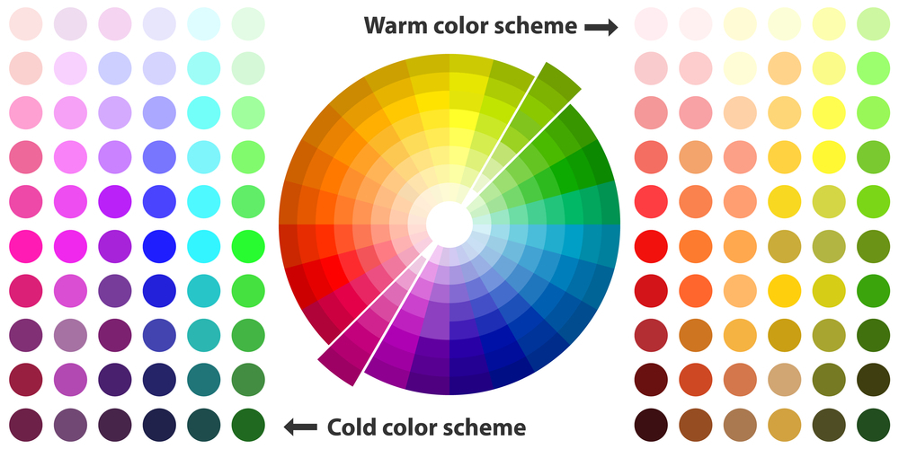
Color theory in web design tips are considered essential when it comes to choosing the perfect color scheme for your website design. When selecting the colors, it is vital to consider the target audience of your product or service. This is because colors have a significant impact on human psychology, and different colors evoke different emotions and moods. For instance, warm colors like red, yellow, and orange are perceived as energetic and exciting, while cool colors like blue and green are calming and soothing. Therefore, if you’re targeting younger consumers, vibrant and bold colors would be the best choice. If your target audience is more mature, then subdued and neutral colors will be ideal. In conclusion, understanding your audience’s preferences is crucial when choosing the right color scheme for your website design. It would be best to keep in mind the color theory in web design tips to ensure that your website design is visually appealing and effective.
Color theory is a crucial aspect of web design, as it can greatly affect the emotional response of a website’s audience. Different colors carry different meanings and can evoke various emotions in viewers. Therefore, it’s important for designers to carefully select a color palette that resonates with the intended demographic. For instance, warm colors like red and orange may generate feelings of excitement or passion, while cool colors like blue and green may convey a sense of calmness or serenity. Designers should also consider cultural meanings associated with different colors, as these may vary based on the target audience’s background. Overall, color theory in web design is an essential tool for effectively communicating the desired message and connecting with the audience on an emotional level.
Next, when it comes to web design, color theory plays a crucial role in creating impactful and memorable designs. Careful consideration of color choices can evoke different emotions and responses from your intended audience. For example, blue is often associated with trust and loyalty, while red can evoke feelings of excitement and urgency. It is important to understand how color can affect perception and ensure that the chosen colors align with your brand values and messaging. In conclusion, keeping in mind the principles of color theory in web design tips can help you create visually appealing and effective designs that resonate with your target audience.
Keep It Simple – Stick to a Maximum of 3 Colors
Web design is a crucial aspect of creating an effective online presence, especially in this digital age. It is essential to keep in mind that simplicity is key when designing a website. A website with too many flashy features can be distracting and overwhelming for the user. The same goes for the use of color. It is always advisable to use no more than three colors in a design. Using too many colors can lead to confusion and make the website’s message harder to interpret. The use of simple, clean designs with a limited color palette leads to clarity and makes the website user-friendly. Therefore, as a web designer, it is crucial to be conscious of the number of colors you are using and aim to stick to a maximum of three colors to create a beautiful and user-friendly design.
Color theory plays a crucial role in web design, and sticking to a maximum of three colors can significantly improve the overall aesthetics and user experience of a website. By incorporating a simple color palette, you can create a sophisticated look that is visually pleasing and easy for users to navigate. Moreover, it can make your content appear more organized and professional, which is essential in creating a positive impression on your audience. By applying color theory in web design tips, you can make your website stand out from the competition and leave an enduring impact on your users. So, if you want to create a visually appealing website, be mindful of the color palette you choose and stick to a maximum of three colors.
Besides, implementing an effective color scheme in your website design carries a lot of weight in the overall impact of your brand message. Therefore, it is essential to understand the basics of color theory in web design tips. By carefully selecting a few colors for your branding, you can create a visually appealing website that is easy to navigate and will help to establish trust and credibility with your audience. So, the next time you start working on your web design project, remember to keep it simple, and let the right color scheme do the job for you. By doing so, you are sure to create a lasting impression that resonates with your audience and effectively communicates your brand message across all platforms and devices.
Utilize Color Theory Principles
Web design is a crucial aspect of building a successful website, and one of the key elements to consider is the choice of colors. To create an aesthetically pleasing design that attracts and retains visitors, it is important to utilize principles from color theory. This theory offers guidance on how particular colors impact the overall design and how they interact with each other. For instance, choosing complementary colors – those that are opposite each other on the color wheel – creates a visual balance that is both appealing and harmonious. On the other hand, using too many colors or contrasting colors can make the website look cluttered and unprofessional. Hence, it’s crucial to choose the right color palette to ensure that your website looks visually appealing, engaging, and professional.
Furthermore, incorporating color theory in web design tips can greatly enhance the visual appeal of a website and make it stand out amongst its competitors. By understanding the principles of color harmony and contrast, designers can strategically select colors that evoke certain emotions and enhance the overall user experience. From highlighting important information to promoting a brand’s identity, the use of complementary colors in web design can make a significant impact on the success of a website. Thus, by taking these tips into consideration, web designers can create beautiful and effective designs that engage and delight users.
Test and Monitor Results Continuously
In the world of web design, testing and monitoring results come as a crucial factor for success. These two elements are integral to the smooth functioning and maintenance of a website. By testing a website, designers can determine whether it is functioning correctly or not. Once any issues are detected, they can then make the necessary corrections early on, ensuring that the overall quality of the design is not compromised. Moreover, monitoring results enable designers to keep track of how the website is performing, how visitors are interacting with it, and whether any improvements are required. A website that is not tested and monitored regularly can lead to many problems, including broken links, slow loading times, and a high bounce rate. Hence, it is imperative to prioritize testing and monitoring results to ensure a successful web design. It is only through effective testing and monitoring measures that a website can achieve maximum functionality and user experience.
Also, another important aspect of web design is color theory, which can greatly impact the overall look and feel of a website. It is important to consider the psychology behind different colors and how they can evoke certain emotions in users. For example, using warm colors such as red or orange can create a sense of urgency or excitement, while cooler colors such as blue or green can create a calming effect. By understanding color theory in web design, we can choose the right color palette for our website and create a cohesive, visually appealing design. In conclusion, by continuously testing and refining our design while also considering color theory tips, we can create a website that not only looks great but also functions optimally for all users.
Final Say
In conclusion, choosing the right color scheme for your website can seem like a daunting task, but it doesn’t have to be. By following these 5 rules of color theory, you can create a website that is visually appealing and professional. Keep in mind the emotions and associations that different colors evoke, use contrast to make certain elements stand out, and don’t be afraid to experiment with different hues and shades. With a little bit of creativity and an understanding of color theory, you can design a website that reflects your brand’s personality and leaves a lasting impression on your visitors. Good luck and happy designing!