Hey there, fellow design enthusiasts! Are you tired of the same old boring navigation menus on websites? Well, you’re in for a treat because today we’re diving into the realm of sticky navigation menus and exploring five creative ways to design them. We all know how important navigation is for a seamless user experience, but why settle for something ordinary when you can make it extraordinary? In this blog post, we’ll uncover some fantastic ideas that will not only make your navigation menu stand out but also keep it glued to the top of the screen as users scroll down your webpage. So, grab your stylus, flex your creative muscles, and let’s revolutionize the way we navigate the web!
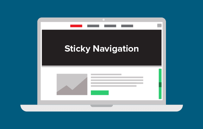
What Is A Sticky Navigation Menu?
Web design encompasses various elements aimed at enhancing user experience and facilitating navigation. One of these crucial features is a sticky navigation menu, designed to assist visitors in effortlessly accessing the main pages of a website. With this functionality, users can conveniently navigate through different sections of a website without the need to scroll back to the page’s beginning. This user-friendly feature streamlines the browsing experience, ensuring easy access to essential content and promoting engagement with the site. By incorporating a sticky navigation menu into web design, designers can optimize usability and provide a seamless browsing experience for visitors, ultimately improving the overall functionality and appeal of a website.
Sticky navigation is an essential component of web design that ensures a seamless and user-friendly experience. By keeping the menu visible as users scroll, it offers quick and easy access to various sections of a website. This type of navigation menu, often referred to as “sticky,” remains fixed on the screen regardless of how far visitors scroll down a webpage. This feature enhances usability by allowing users to effortlessly navigate from any part of the site without having to constantly scroll back up to access the menu. Sticky navigation not only improves the overall aesthetic appeal of a website but also provides convenience and efficiency in accessing different pages or sections. By implementing this technique, web designers can optimize the user experience, enhancing engagement and increasing the likelihood of visitors exploring more content on the site. So, if you are a web designer seeking to improve user navigation and retention, mastering the art of sticky navigation is crucial.
Besides improving user experience, sticky navigation menus offer several other benefits in the realm of web design. By creating a sense of consistency throughout the website, these menus enable users to effortlessly navigate from one page to another, ensuring a smooth and seamless browsing experience. With quicker access to important information and features, users can easily find what they are looking for without wasting time. This not only increases user satisfaction but also encourages them to spend more time on the website, thereby boosting engagement and potentially leading to higher conversions. Overall, incorporating sticky navigation menus into web design not only enhances user experience but also contributes to the overall success of a website by increasing usability and driving positive outcomes.
Designing A Sticky Navigation Menu: Benefits and Limitations
Sticky navigation: How to Keep the menu visible as users scroll. In the realm of web design, creating a sticky navigation menu can greatly benefit users. By ensuring that the navigation links remain constantly visible and accessible on all pages, website visitors are empowered to effortlessly navigate through the different sections and swiftly find the information they desire. This feature is particularly advantageous as users scroll, as it eliminates the need to constantly scroll back to the top of the page in order to access the menu. The sticky navigation, with its persistent presence, serves as a reliable guide, helping users seamlessly move around the website and enhancing their overall browsing experience.
Moreover, while the feature of taking up screen real estate for web design elements is a limitation, it is important to consider its potential impact on the overall user experience. Balancing the need for dynamic and engaging visuals with the necessity of providing enough space for other essential elements requires careful consideration and strategic design choices. Web designers must find innovative ways to incorporate this feature without overwhelming the user interface or hindering the accessibility of other essential elements. By carefully considering the trade-offs and making thoughtful design decisions, web designers can ensure that this feature enhances the overall user experience and contributes to the success of the website.
Customizing A Sticky Navigation Menu with HTML and CSS
When it comes to web design, one aspect that often requires attention is the navigation menu. A sticky navigation menu, also known as a fixed or floating menu, ensures that the menu remains visible to users as they scroll through a webpage. This feature is especially useful for websites with long pages or extensive content. There are several techniques available to customize a sticky navigation menu. One such method involves adding HTML elements and then styling them using CSS. This allows for personalized design choices that align with the overall aesthetics of the website. By using these techniques, web designers can create visually appealing and user-friendly navigation menus that enhance the overall browsing experience. So, whether you want to implement a sticky navigation menu on your website or simply enhance its appearance, understanding the process is crucial. With the right HTML and CSS elements, you can ensure that your menu remains visible and functional while keeping in line with your desired web design.
In the realm of web design, having control over the layout and appearance of your navigation menu is crucial. Luckily, with a little know-how, you can easily customize its height, width, and positioning to suit your needs. By manipulating the existing HTML code or incorporating supplementary HTML and CSS styling, you can achieve the desired results. Whether you prefer a sleek, minimalistic look or a bold, eye-catching design, the flexibility lies in your hands. Don’t be afraid to experiment and play around with different configurations until you find the perfect fit for your website. With a touch of creativity and an understanding of these fundamental techniques, you can elevate your navigation menu to a whole new level. So dive in, embrace your inner web designer, and transform your website’s navigation into a seamless and visually captivating experience for your users.
Moreover, in the realm of web design, the use of custom JavaScript code to animate the position of the navigation menu as it scrolls down the page offers a remarkable opportunity to enhance the user experience. By incorporating this dynamic feature, web designers can create visually engaging websites that captivate and guide users seamlessly through the content. This animated navigation menu adds an element of interactivity and sophistication, elevating the overall aesthetic appeal of the website while simultaneously providing a practical function. With the ability to seamlessly integrate custom JavaScript code, web designers have the power to breathe life into their creations, leaving a lasting impression on visitors and ensuring they have an enjoyable and memorable browsing experience.
Optimizing Navigation Menus for Mobile Devices
In the realm of web design, one crucial aspect that contributes to an optimal user experience is the mobile navigation menu. By keeping this essential element concise and uncluttered, designers can ensure that users can effortlessly navigate through a website without distractions. Too many options in the menu can overwhelm visitors and hinder their ability to find the desired information or complete the intended action. Therefore, a thoughtful and deliberate approach should be taken to remove any unnecessary or rarely used items from the menu. By doing so, designers can streamline the user experience, allowing users to easily access key features and content. Overall, prioritizing simplicity and decluttering mobile navigation menus can significantly enhance the overall usability and functionality of a website.
In conclusion, web designers play a crucial role in enhancing user experience through effective navigation design. By prioritizing intuitive menus and incorporating familiar labels and clear visual cues, they can guide users easily to their desired content. This not only helps visitors find what they are looking for efficiently but also ensures they have a seamless and enjoyable browsing experience. Moreover, by focusing on improving navigation, designers can minimize user frustration and increase engagement, ultimately benefiting both the users and the website owners. Therefore, it is paramount for web designers to invest time and effort into creating intuitive menus and visual cues, as it significantly contributes to the success and effectiveness of web design.
Enhancing Interactivity with JavaScript Components
When it comes to web design, JavaScript emerges as an incredibly powerful scripting language that holds immense potential for creating dynamic and engaging user experiences on websites. One of the remarkable features of JavaScript is its ability to provide interactive components that can enhance the overall website functionality. By utilizing these interactive components, web designers can craft customized and personalized web experiences for their visitors. A notable example of this is the implementation of sticky navigation, which allows the website’s menu to remain visible to users even as they scroll through the content. This feature ensures easy access to navigation options at all times, facilitating seamless browsing and effortless exploration of the website. With JavaScript’s capabilities, web designers can effortlessly incorporate sticky navigation into their designs, thereby enhancing the user experience and creating a visually appealing and user-friendly website.
Web design has come a long way in recent years, and one of the key elements that contribute to a successful and engaging website is the use of JavaScript components. These components offer a wide range of features, from drag-and-drop elements to image galleries, that can truly enhance the interactivity and engagement of your web pages. Whether it’s a captivating slideshow or a seamless navigation system, JavaScript components have the power to transform your website into an immersive digital experience. One particularly useful feature is sticky navigation, which keeps the menu visible as users scroll through the page. This not only adds a touch of professionalism to your design but also ensures that visitors can easily access important sections or pages without having to scroll back up. By providing visual cues and making navigation effortless, JavaScript components not only enhance the overall user experience but also contribute to a more efficient and user-friendly website. So, if you’re looking to create a visually appealing and intuitive website, incorporating JavaScript components into your web design is definitely something to consider.
Finally, incorporating JavaScript components into your web design not only enhances the overall user experience but also has significant benefits in terms of search engine optimization and personalization. By implementing features like sticky navigation, where the menu remains visible as users scroll, you can further elevate the usability and aesthetics of your website. This ensures that vital navigation options are always easily accessible, improving user engagement and reducing bounce rates. With the ability to tailor their experience based on personal preferences, visitors gain a sense of empowerment and are more likely to stay on your site for longer periods, ultimately increasing conversions and driving business growth. In conclusion, leveraging JavaScript components, such as sticky navigation, is crucial in maximizing the effectiveness of your web design, positively impacting both search engine rankings and user satisfaction.
Tips for Improving User Experience with a Sticky Navigation
When it comes to web design, creating a sticky navigation for improved user experience is a crucial aspect that should not be overlooked. The key objective is to ensure that the menu remains visible as users scroll through the website. To achieve this, it is essential to consider how the user perceives the navigation. By employing contrasting colors and incorporating design elements that stand out, the user’s ability to easily find and interact with the navigation is greatly enhanced. In this way, the sticky navigation becomes a valuable tool in enhancing the overall user experience and making navigation effortless.
Thus, in the realm of web design, creating a well-organized and easily navigable user interface is of paramount importance. One way to achieve this is by implementing a sticky navigation that is both intuitive and searchable. By doing so, designers can ensure that users can effortlessly locate the desired menu items without feeling overwhelmed or confused by convoluted navigation structures. This approach not only enhances user experience but also contributes to the overall success of a website, as it directly impacts user engagement, satisfaction, and retention. Therefore, incorporating a sticky navigation that is intuitively organized and searchable proves to be a valuable tool in the arsenal of web designers, enabling them to create a user-friendly interface that supports seamless browsing and efficient information retrieval.
To Conclude
In conclusion, navigation menus are a crucial element in website design, and by exploring the realm of sticky navigation menus, we have discovered five creative ways to take them to the next level. With these fantastic ideas, you can make your navigation menu stand out and stay fixed at the top of the screen as users scroll down your webpage. So, why settle for something ordinary when you can revolutionize the way we navigate the web? Let your creativity flow and create a truly extraordinary user experience. Get ready to leave a lasting impression on your visitors and guide them seamlessly through your website’s content.