
When local customers search for your business, they are often using a smartphone. They may be comparing service providers, checking your hours, looking for directions, or deciding whether to call.
Your website needs to support that decision immediately.
A mobile-friendly website does more than adjust your layout for a smaller screen. It helps customers find information, understand your offer, trust your business, and take the next step. It also gives Google a clearer, more accessible version of your content to crawl and evaluate.
In 2026, mobile optimization is not an optional improvement. It is a core part of building visibility, trust, and leads through local search.
Mobile is where many local decisions begin
Local customers often search with a specific purpose:
- Finding a nearby service provider.
- Checking whether a business is open.
- Calling to ask a question.
- Requesting directions.
- Booking an appointment.
- Comparing several businesses before making contact.
These actions frequently happen on a phone. A customer may discover your business while commuting, during a work break, or while standing near your location.
That means your mobile website must answer important questions quickly:
- What does your business do?
- What area do you serve?
- Why should customers choose you?
- How can someone call, book, visit, or request a quote?
If your pages are difficult to read or your buttons are hard to tap, the customer may return to the search results and choose a competitor. Local search can bring visitors to your website, but your mobile experience helps determine whether those visitors become customers.
Google evaluates your mobile content first
Google uses the mobile version of a website’s content for indexing and ranking. This approach is called mobile-first indexing.
According to Google Search Central’s mobile-first indexing guidance, Google recommends responsive design because it is easier to implement and maintain. Responsive websites use the same URL and content while adapting the layout to different screen sizes.
This creates an important responsibility for your business. Your mobile site should not be a reduced version that hides essential information. It should include the same important content as the desktop version, including:
- Clear page titles and headings.
- Service descriptions.
- Location and service-area information.
- Contact details.
- Relevant images.
- Structured data where appropriate.
- Helpful content for customers.
Google specifically advises businesses to maintain equivalent content, metadata, and structured data across mobile and desktop experiences.
Mobile-first indexing does not mean that a mobile-friendly website automatically reaches the top of local search results. Local visibility also depends on relevance, distance, prominence, content quality, reviews, and other factors. However, a poor mobile experience can make it harder for Google to access your content and harder for customers to use it.
A responsive design creates a better customer experience

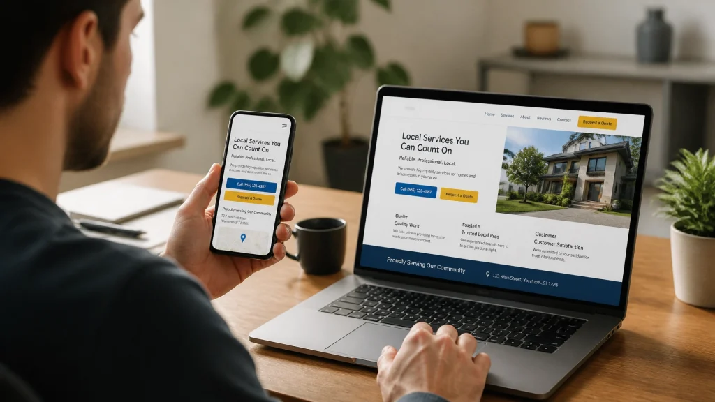
Responsive design allows your website to adapt to phones, tablets, laptops, and desktop monitors. The layout, images, buttons, and text adjust based on the visitor’s screen.
For your customers, this creates a smoother experience. They do not need to pinch, zoom, rotate their phone, or scroll sideways to understand your business.
A strong responsive website should provide:
- Readable text without zooming.
- Buttons large enough to tap comfortably.
- Simple navigation that works on smaller screens.
- Images that fit the screen without slowing the page.
- Forms that are easy to complete from a phone.
- Content that remains clear at every screen size.
- Consistent branding across devices.
Your website should feel natural to use. Customers should be able to move from discovery to action without unnecessary steps.
This is one reason our web design services focus on more than visual appearance. We build modern, responsive websites designed to represent your business and support measurable growth.
Faster pages help protect your leads
Mobile visitors may be using a cellular connection or an older device. Large images, unnecessary scripts, and complex page elements can make your website feel slow.
A slow page creates friction before customers even see your message.
Google’s Core Web Vitals provide useful benchmarks for understanding page experience. The current Core Web Vitals focus on:
- Largest Contentful Paint: How quickly the main content appears.
- Interaction to Next Paint: How quickly the page responds when someone interacts with it.
- Cumulative Layout Shift: How stable the page remains as it loads.
The Web Vitals guidance from Google recommends a Largest Contentful Paint of 2.5 seconds or less, an Interaction to Next Paint of 200 milliseconds or less, and a Cumulative Layout Shift of 0.1 or less at the 75th percentile.
These measurements do not replace good judgment. Your website should also feel fast and dependable to real customers.
Practical improvements include:
- Compressing and properly sizing images.
- Removing unnecessary plugins and scripts.
- Using reliable hosting.
- Improving server response times.
- Loading important content efficiently.
- Testing pages on real mobile devices.
- Reviewing performance in PageSpeed Insights.
Better performance can help customers stay engaged long enough to read your content and contact your business.
Mobile usability supports stronger local search performance
Google’s local search results are mainly shaped by relevance, distance, and prominence. You can learn more about these factors in Google’s guide to improving your local ranking.
Your mobile website supports each part of that process in practical ways.
Improving relevance
Your website helps Google understand what you offer. Clear service pages, helpful headings, natural local language, and accurate business information give search engines more context.
For example, a dental practice can clearly explain its preventive, cosmetic, and emergency services. A contractor can describe the types of projects it completes and the communities it serves.
Your content should use familiar language that matches how customers describe their needs. Avoid filling pages with repeated location phrases. Instead, provide useful information for real people in your service area.
Supporting distance signals
Your website should make your location or service area easy to understand. Include accurate information about:
- Your business address, if customers visit you.
- The cities or neighborhoods you serve.
- Your service boundaries.
- Your phone number.
- Your hours.
- Directions or parking details.
These details should match your Google Business Profile and other important listings.
Strengthening prominence
Prominence reflects how established and trusted your business appears online and offline. Your website can support this through:
- Customer testimonials.
- Case studies.
- Helpful local content.
- Links from relevant organizations.
- Consistent business information.
- Clear evidence of your experience.
A mobile-friendly design ensures that customers can actually view this trust-building content when they discover you through a phone.
Make local actions easy to complete

A local website should be designed around the actions your customers want to take.
Place important calls to action where mobile visitors can see and use them. Depending on your business, these may include:
- Call now.
- Request a quote.
- Book an appointment.
- Get directions.
- View services.
- Send a message.
- Check availability.
Use descriptive button text instead of vague labels such as “Submit” or “Learn more.” A button that says “Request a quote” gives the visitor a clear expectation.
Your phone number should be easy to find and tap. Forms should request only the information you genuinely need to begin a conversation. If customers need directions, provide clear location details and a link to a map.
Small improvements can remove major points of friction. A customer who can complete the next step in a few taps is more likely to contact you.
Connect mobile design with local SEO
Mobile optimization works best when it is part of a complete local marketing strategy.
Review these areas together:
Keep business information consistent
Use the same business name, address, phone number, website URL, and hours across your website, Google Business Profile, directories, and social profiles.
Build useful local pages
Create service and location pages when they provide genuinely different information. Explain the customer needs you address, the areas you serve, and what makes your process helpful.
Improve your Google Business Profile
Choose accurate categories, update your services and hours, add relevant photos, and respond professionally to reviews.
Use clear website structure
Organize your navigation around customer needs. Your most important services and contact options should be easy to reach from a mobile screen.
Track meaningful results
Monitor more than traffic. Review calls, form submissions, booked appointments, quote requests, direction requests, and engagement on important landing pages.
Our local SEO approach connects search visibility with the customer experience that follows the click.
Test your website before customers do

You can begin with a simple mobile website review:
- Open your website on several phones.
- Check whether the homepage loads quickly.
- Confirm that text is readable without zooming.
- Tap every menu item and major button.
- Test your contact forms.
- Call the phone number from the website.
- Check that maps and directions work correctly.
- Review your key service and location pages.
- Test your website with PageSpeed Insights.
- Compare the mobile content with the desktop version.
Pay particular attention to the pages customers reach from local search. Your homepage matters, but service pages, location pages, contact pages, and booking pages often have a direct connection to lead generation.
Build a mobile experience that supports growth
Your website should do more than look professional on a desktop monitor. It should help local customers find you, understand your value, trust your business, and take action from the device they use most.
At MyNash Web Design, we combine responsive web design, local SEO, conversion optimization, and ongoing support to help local businesses build stronger online presences. We do not treat design and SEO as separate tasks. We build websites with visibility, usability, leads, and long-term growth in mind.
If your website needs a stronger mobile experience, get a quote from MyNash Web Design. We would be glad to learn about your business and help you plan the next step.