Hey there fellow web designers! Have you ever stumbled upon a website with a navigation system so confusing that you couldn’t find your way to the desired page? We’ve all been there, and it’s frustrating as heck! As designers, it’s our responsibility to create websites that are not only visually appealing but also easy to navigate. After all, what good is a stunning design if users can’t find what they’re looking for? In this blog post, we’re going to dive deep into the realm of website navigation and share with you 6 awesome tips to help you design a navigation system that is intuitive, user-friendly, and ensures a seamless browsing experience for your visitors. So, grab your favorite beverage, sit back, and get ready to level up your web design skills!
Defining Goals for Intuitive Website Navigation
“How to create User-friendly navigation on your website” is an essential aspect of web design. When defining goals for intuitive website navigation, it is crucial to consider the needs of the audience. Understanding what content and features are most important to them will play a significant role in informing the design decisions you make. By prioritizing the preferences and expectations of your users, you can create a website that offers a seamless and user-friendly navigation experience. This entails organizing and structuring information in a logical and intuitive manner, making it easy for visitors to find what they are looking for. With user-friendly navigation, you can enhance the overall user experience and ensure that individuals can easily access the desired content and features on your website.
Moreover, in the realm of web design, ensuring an optimal user experience goes beyond just creating a visually appealing website. It requires careful consideration of how users will navigate between pages, ensuring that menu items are easily visible and located. The accessibility and speed at which users can access information is crucial as well. Designing a logical and intuitive search function allows users to quickly and efficiently find specific topics or content. By addressing these key factors, web designers can create a seamless and enjoyable browsing experience for users, ultimately resulting in increased engagement and satisfaction.
Designing a Structure for Easy Accessibility
When it comes to web design, creating a user-friendly navigation on your website is crucial for easy accessibility. To achieve this, start by considering the layout of the navigation bar. By designing a well-structured navigation system, you can provide visitors with a clear and intuitive path to find the content they are looking for quickly and efficiently. When users land on your website, they should be able to easily locate the information or products they desire without any confusion or frustration. Incorporating user-centric design principles in your navigation, such as logical categorization and descriptive labels, will further enhance the overall user experience. Remember that simplicity is key, so avoid cluttered menus or overwhelming options that may overwhelm or confuse visitors. By prioritizing user navigation, you can enhance the usability of your website and ultimately provide a positive and effortless browsing experience for your audience.
When it comes to web design, one important aspect to consider is the use of intuitive labels that accurately reflect the content. This ensures that users can easily navigate through the website and find what they are looking for without any confusion. By using clear labels, such as “Home,” “About,” or “Contact,” visitors can quickly understand the purpose and function of each menu item. In addition, it is crucial to make sure that all menus are easily accessible from any page on the website. This allows users to navigate seamlessly and efficiently, enhancing their overall experience. Whether it is a main navigation menu or a drop-down submenu, all menus should be readily available and visible to users throughout their browsing session. By implementing these practices, web designers can create a user-friendly and intuitive website that caters to the needs and preferences of their audience.
Moreover, creating user-friendly navigation on your website is crucial to ensure a seamless user experience. When visitors land on your website, they should be able to easily navigate through the various pages and find the information they are looking for effortlessly. By implementing clear menus, intuitive icons, and logical organization, you are providing users with a roadmap to explore your content. User-friendly navigation not only helps visitors find what they need but also enhances their overall experience on your website. Furthermore, it is essential to make sure your website is mobile-friendly so that visitors can access your content from any device in an optimal way for them. With the increasing use of smartphones and tablets, having a responsive design that adapts to different screen sizes is a must. By prioritizing mobile-friendliness, you are ensuring that your website remains accessible and visually appealing across all devices, leading to higher user engagement and satisfaction. In conclusion, by focusing on user-friendly navigation and mobile responsiveness, you can create a website that delivers a positive experience for your visitors, encouraging them to stay longer, explore more, and ultimately achieve your desired goals.
Constructing Effective Labeling for Navigation Links
When it comes to web design, constructing effective labeling for navigation links is crucial. To ensure a seamless user experience, it is important to first consider the context in which these links will be used. Understanding the overall goal of the user journey plays a significant role in this process. By identifying the objectives of the website and what users are trying to achieve, you can create labels that are intuitive and straightforward. The keywords “web design” emphasize the focus of this paragraph, highlighting the importance of thoughtful navigation labeling in creating a successful website. Adopting a professional and informative tone, this paragraph emphasizes the significance of considering user goals and creating clear labels to help users navigate to their desired destinations efficiently.
Besides creating a visually appealing website, it is crucial to prioritize user experience by focusing on user-friendly navigation. Once you have an understanding of how users will be navigating your website, begin organizing your navigation links into natural groups that make sense to users. By doing so, you can effectively reduce cognitive load and make it easier for users to quickly find what they’re looking for. Remember, the goal is to create a seamless and intuitive browsing experience that keeps users engaged and encourages them to explore further. So, take the time to carefully structure your navigation, ensuring it aligns with the needs and expectations of your target audience. Implementing user-friendly navigation on your website not only enhances usability but also boosts overall satisfaction, leading to increased engagement and ultimately contributing to the success of your online presence.
Utilizing Responsive Design Elements
When it comes to web design, one crucial aspect is creating a user-friendly navigation system on your website. An essential technique to achieve this is by implementing responsive design. With responsive design, you can ensure that no matter what device a user is using, whether it be a desktop computer, tablet, or smartphone, your website’s layout will always look optimal and professional. This approach allows your website to adapt and adjust its elements dynamically, creating an intuitive and smooth user experience. By incorporating responsive design into your web design strategy, you can enhance the accessibility and usability of your website, making it easier for visitors to navigate and find what they are looking for. Whether it’s a dropdown menu, a sidebar, or a hamburger icon leading to a hidden navigation panel, responsive design enables you to place navigation elements conveniently while maintaining a visually appealing and cohesive aesthetic. By focusing on responsive design and creating user-friendly navigation, you can ensure that your website engages and retains its audience in the most effective way possible.
Also, having a mobile-responsive website is crucial in today’s digital age. With the increasing use of smartphones and tablets, users are accessing websites on a wide variety of devices. By implementing a mobile-friendly design, web designers can ensure that visitors have a seamless and enjoyable browsing experience regardless of the device they are using. This not only enhances user satisfaction but also improves search engine rankings, as search engines like Google prioritize mobile-friendly websites in their search results. Therefore, when considering web design, it is vital to prioritize mobile responsiveness to provide users with the optimal experience no matter where they are accessing your site.
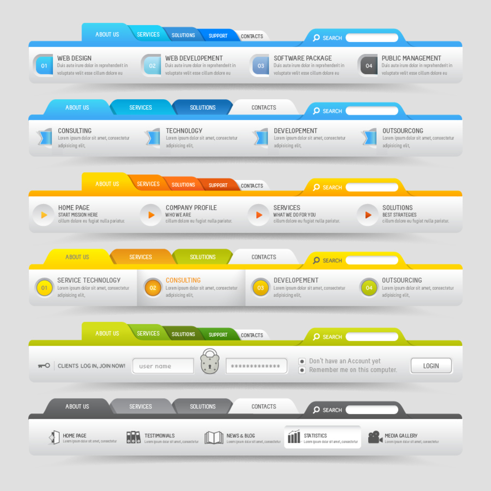
Placing Site-Wide Search Functionality
When it comes to web design, creating user-friendly navigation is paramount. One effective way to achieve this is by incorporating a strategically placed search box on every page of your website. This simple yet crucial feature can greatly enhance the overall user experience. By having a search box readily available, visitors can effortlessly access the exact information they are looking for in no time. Whether they are seeking specific products, services, or even articles, this convenient tool ensures quick and easy navigation throughout the site. By optimizing user experience through the inclusion of a search box, you can significantly improve the functionality and usability of your website, ultimately leading to higher customer satisfaction and engagement. So, don’t underestimate the power of a well-placed search box in your web design; it can make a world of difference in enhancing your visitors’ browsing experience.
When it comes to web design, creating user-friendly navigation is crucial. One effective way to achieve this is by placing a search box in a prominent spot on each page. By doing so, visitors can easily find the specific content they are looking for, which helps to reduce the amount of time spent navigating through the website. This not only enhances the overall user experience but also has the added benefit of reducing bounce rates. By incorporating a search box as a prominent feature, users can quickly and efficiently find what they need, resulting in increased satisfaction and engagement. Therefore, if you want to improve the navigation on your website and make it more user-friendly, consider implementing a prominent search box in your web design.
Again, incorporating relevant keywords into the search results is a crucial element of effective web design. By strategically placing these keywords, you can entice users to delve deeper into your website, exploring additional pages and valuable content. This not only boosts traffic to your site but also has the potential to increase conversions, as users are more likely to engage with your offerings when they find the information they are searching for. By implementing a well-thought-out web design strategy that includes the use of relevant keywords, you can not only enhance user experience but also drive the success of your online presence.
Implementing User Testing and Quality Assurance Checks
User testing and quality assurance checks play a crucial role in the web design process, especially when it comes to creating user-friendly navigation on your website. Understanding how users interact with your site is essential to ensure the best browsing experience. By incorporating feedback from actual users during the testing phase, designers can fine-tune the navigation system to meet their needs, preferences, and expectations. This iterative approach allows for continuous improvements, resulting in a seamless and intuitive browsing experience for visitors. Ultimately, by prioritizing user testing and quality assurance checks, web designers can create websites with navigation that is both user-friendly and effectively guides visitors through the desired content.
When it comes to web design, quality assurance checks play a crucial role in ensuring a smooth and user-friendly experience for visitors. These checks provide an additional layer of protection against any technical issues that may arise during the deployment phase. By thoroughly examining the website and its components, quality assurance can identify potential usability issues before they negatively impact the user experience. Particularly relevant to this topic is how to create user-friendly navigation on your website. By conducting rigorous checks on the website’s navigation system, designers can ensure that it is intuitive, easy to navigate, and enhances the overall user experience. Through meticulous attention to detail, quality assurance checks help in creating a seamless and enjoyable user journey.
Also, by implementing user testing and quality assurance checks, we can confidently say that our web design exceeds our standards for usability and quality. Through thorough testing, we can identify any potential issues or flaws in the design, allowing us to make necessary improvements and alterations. This ensures that our website not only meets the needs of our target audience but also delivers an optimal user experience for all visitors. With user-focused design and a commitment to quality, our web design will not only be visually appealing but also highly functional and intuitive. By incorporating user testing and quality assurance into our web design process, we are setting a higher standard for ourselves and ensuring that every visitor has a seamless and enjoyable experience on our website.
Final Say
In conclusion, designing an intuitive website navigation system is crucial for ensuring a positive user experience. By implementing the 6 tips shared in this blog post, you can create a navigation system that seamlessly guides users through your website, allowing them to easily find what they’re looking for. Remember to prioritize simplicity, consistency, and clarity in your design, and always put yourself in the shoes of your users. With a well-designed and intuitive navigation system, you can enhance the overall usability and effectiveness of your website while leaving a lasting impression on your visitors. So, go ahead and apply these tips to level up your web design skills and make your website truly user-friendly.