Are you struggling to get people to click on your call-to-action (CTA)? You’re not alone! Crafting the perfect CTA can be tricky, and even the best marketers sometimes make mistakes. In this blog post, we’ll look at five common CTA mistakes that you might be making, and show you how to fix them. From unclear messaging to poor placement, we’ll cover everything you need to know to create CTAs that convert. Whether you’re a seasoned marketer or just starting out, this post is for you. So, grab a coffee, sit back, and let’s dive in!
What are Common CTA Mistakes?
When it comes to web design, one of the most important factors to consider is the call-to-action (CTA). However, one of the most common CTA mistakes that businesses make is not making it prominent enough for visitors to see it. If the CTA is not visible, visitors may miss out on opportunities to learn more about a product or service or even purchase it. This can be detrimental to the success of a website as the ultimate goal is often to encourage visitors to take action. To avoid this mistake, CTAs should be strategically placed and designed in a way that draws the eye towards them. In today’s competitive online market, making effective use of CTAs could be the difference between a successful website and one that fails to convert visitors into customers.
In the world of web design, a lack of contrast can be a major issue when it comes to CTAs (call-to-actions). If the CTA does not stand out from other page elements, visitors may struggle to find it and take the desired action. This is why it’s crucial to ensure that the CTA is designed with sufficient contrast compared to other elements on the page. A high-contrast color scheme or a bold font can help make the CTA more noticeable and draw attention to it. Websites that prioritize clear and distinct CTAs are more likely to achieve their conversion goals, leading to increased engagement and customer satisfaction. By keeping this in mind, it’s possible to create a seamless user experience that effectively guides visitors towards desired actions.
Next, it is imperative that web designers take heed of the importance of a concise and clear call-to-action (CTA) message. Failing to include a clear message could be detrimental to the success of a website, and could lead to missed opportunities for conversions. A CTA should be focused on one specific action that the user should take, and the message should be succinct and to the point. Including too many different messages in the CTA could confuse the user and detract from the intended goal of the website. Therefore, a well-designed and clear CTA is a key component of effective web design that can help to drive conversions and achieve successful outcomes for businesses.
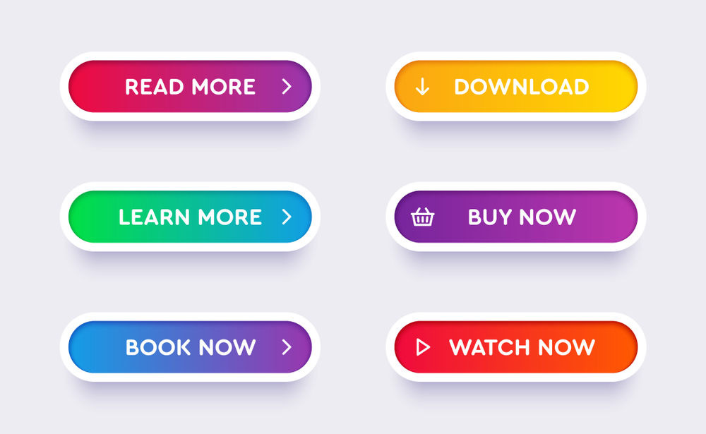
Poorly Designed Call-to-Action Button
When it comes to web design, creating effective call-to-action (CTA) buttons is crucial for the success of a website. Unfortunately, many designers make the mistake of poorly designing their CTAs, resulting in buttons that blend in with the overall design of the page and fail to grab the attention of visitors. This can ultimately lead to lower conversion rates and less engagement from users. To avoid this common pitfall, it’s important to implement top tips to create better CTAs on your website. This includes utilizing contrasting colors and fonts to make your CTA stand out, placing them in strategic locations on the page, and using clear and concise language that clearly communicates the action you want users to take. By taking the time to design and optimize your CTAs, you can create a more effective and engaging website that encourages users to take action.
Moreover, web design is an influential factor in determining the success of online businesses. CTA buttons play a significant role in guiding visitors towards meaningful actions that generate revenue for businesses. The right color, size, and placement of the CTA buttons can have a remarkable impact on the conversion rate of a website. A well-designed website with strategically placed and attention-grabbing CTA buttons can help businesses to achieve their marketing goals and increase their online customer base. In conclusion, it is imperative for web designers to incorporate effective CTA buttons in their design to ensure optimum performance and achieve desired results.
Unclear Messaging in the CTA
When it comes to web design, a clear call-to-action (CTA) is essential for converting visitors into customers. However, if the messaging in a CTA is unclear, it can confuse users and ultimately cause them to undervalue or even disregard the page entirely. This is why investing time into crafting effective CTAs is so important. As one of the top tips to create better CTAs on your website, make sure the messaging is clear and straightforward. Use simple language and avoid any jargon or confusing terminology. Additionally, consider using action-oriented verbs to inspire users to take action. By doing so, you can ensure that your website is not only visually appealing but also effective in driving conversions.
Moreover, creating clear and concise CTAs is one of the top tips to create better CTAs on your website. When designing a website, it is important to keep in mind that users have a limited attention span and may not have the patience to read through lengthy text or decipher confusing language. By including only the most important elements of your message in your CTA, you can increase the chances of users taking the desired action, such as making a purchase or submitting their information. As a result, taking the time to craft effective CTAs can greatly improve the user experience on your website and ultimately lead to increased conversions.
Too Many Options on the Page
Web design plays a crucial role in creating a user-friendly and intuitive website. One of the most common mistakes that web designers make is offering too many options on a single page. This can lead to confusion and frustration for the end-user. When a visitor is overwhelmed with too many choices, they may take longer to make decisions or even abandon the page altogether. This is why it is essential for web designers to carefully consider the layout and design of a website, ensuring that it is easy to navigate and offers a clear hierarchy of content. By designing with the end-user in mind and offering a streamlined experience, designers can create a website that is both visually appealing and functional, ultimately leading to increased engagement and conversions.
Moreover, effective web design is not just about aesthetics, it is also about providing a seamless user experience. One of the most common mistakes designers make is bombarding users with too many options and links, leading to confusion and frustration. By limiting the amount of options on each page and focusing on providing relevant links, users are more likely to find what they need quickly and easily. Additionally, consider what is most important for your users to achieve their goals, whether it be making a purchase or seeking information. By prioritizing their needs and simplifying the user journey, you can improve their experience and ultimately drive engagement and conversions. As a result, taking the time to carefully plan and design your website with these factors in mind can truly make all the difference in creating a successful online presence.
Not Placing the CTA in an Obvious Location
Web design is a crucial aspect of creating a successful online presence. One of the most important elements to consider when designing a website is the Call-To-Action (CTA). CTAs are buttons or links that encourage visitors to take specific actions such as making a purchase, subscribing to a newsletter or filling out a contact form. The placement of CTAs is crucial to their effectiveness. When creating a website, it is essential to ensure that the CTA is placed in a noticeable location so that visitors can easily identify it. This is one of the top tips to create better CTAs on your website. A well-placed and well-designed CTA can significantly increase the conversion rate of visitors into customers. Therefore, it is important to choose the right colours, fonts and sizes for your CTAs to create a more appealing and engaging experience for your visitors. Remember, your website should be user-friendly, and the CTA should be clear and easy to find. By following these tips, you can make sure that your website is effective in converting visitors into loyal customers.
In web design, the placement of a Call to Action (CTA) is crucial for success. If the CTA is hidden in an out-of-the-way corner of the website, users will have to actively search for it. This could lead to frustration and ultimately, fewer conversions. The placement of the CTA should be strategic and easy to find. A common mistake is placing the CTA at the bottom of a long scroll, which may be missed by visitors who don’t make it that far down. Instead, incorporating the CTA into the design and ensuring it’s visible from the start can significantly increase conversions. In short, the placement and visibility of the CTA is key to a successful web design.
Finally, when considering web design, it is important for designers to prioritize creating an effective call-to-action (CTA) design that stands out and is easily recognizable. While it can be tempting to fill a webpage with eye-catching graphics and bold fonts, these elements can often detract from the user’s ability to take action. Instead, a well-designed CTA should guide users towards the desired outcome in a clear and concise manner. By emphasizing the importance of CTAs and putting user experience at the forefront of design decisions, designers can create websites that are both visually appealing and highly functional.
Not Testing and Measuring Results
of warning and urgency, encouraging website owners to take the necessary steps to ensure the success of their web design.
When it comes to creating a website, there are many factors to consider in order to make it a success. However, one aspect that is often overlooked but can have a significant impact is testing and measuring. Failing to test and measure your web design can result in missed opportunities for improvement, which can ultimately lead to a lack of engagement and conversion on your website. This is especially true when it comes to calls-to-action (CTAs), which are crucial for encouraging users to take desired actions on your site. Therefore, it is essential to follow the top tips for creating better CTAs on your website and to test and measure them to ensure they are effective. By doing so, you can optimize your web design and increase the likelihood of achieving your desired outcomes. Don’t let the success of your website be left up to chance. Take the necessary steps to ensure its success by testing and measuring your design, especially when it comes to CTAs.
In the field of web design, testing and measuring are essential practices for ensuring the success of any business. Without careful analysis of user behavior and engagement, companies may be unaware of potential problems that could be driving customers away from their website. A poor user experience, confusing navigation, or slow loading times could all contribute to decreased customer engagement and ultimately result in negative impacts on a business’s bottom line. By monitoring and analyzing website metrics, businesses can identify areas that need improvement and make necessary changes to improve user experience and engagement. This proactive approach can create a positive impact on the overall success of a website and the business it represents. Therefore, testing and measuring must be a top priority for any web design project to achieve its goals and objectives.
Also, in order to create a website that is truly user-friendly and effective, it is crucial to focus on your Calls-to-Action (CTAs). These CTAs are what guide users towards taking action and converting on your website. In fact, even small tweaks to your CTA design can lead to significant improvements in conversion rates. By following the Top Tips to Create Better CTAs on Your Website, you can optimize your CTAs for maximum impact and boost your overall website performance. Therefore, testing and measuring your CTAs periodically should be a key part of your ongoing web design strategy, ensuring that your website continues to meet user needs, is optimized for conversions, and delivers a positive user experience.
To Conclude
In conclusion, crafting a successful call-to-action requires careful thought and consideration. By avoiding these common CTA mistakes, you’ll be well on your way to creating compelling CTAs that drive conversions. Remember to keep your messaging clear, use action-oriented language, and place your call-to-action in strategic locations on your website or landing page. With these tips in mind, you’ll be able to create a CTA that resonates with your audience and encourages them to take action. So go ahead and put these tips into practice – we can’t wait to see the results!